Your cart is currently empty!

Designing Accessible Interfaces for Environmental Data
—
In today’s scientific landscape, access to timely and understandable environmental information has become essential for effective decision-making. Scientists, policymakers, and communities require tools that transform complex hydrological and meteorological data into actionable insights.
Tethys Platform, the open-source software that Tethys Geoscience Foundation is built around, has emerged as a solution to this challenge. By enabling researchers and practitioners to create web applications, Tethys Platform facilitates the transformation of environmental models into accessible, interactive tools
Today we examine how thoughtful interface design can bridge the gap between sophisticated environmental models and the diverse users who rely on them. By analyzing successful implementations in the field, we can identify key principles that make complex data accessible without sacrificing scientific integrity or analytical depth. The evolution of environmental data platforms has demonstrated that effective visualization isn’t merely aesthetic—it’s fundamental to the utility and impact of scientific tools.
Making Complex Data Accessible
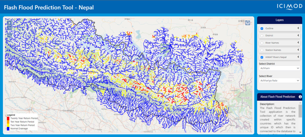
The Flash Flood Prediction Tool for Nepal demonstrates effective data visualization through its color-coded risk system. By using a simple blue-to-red scale to indicate flood risk levels across 12,000 river segments, the interface makes critical information immediately understandable. The system employs blue for normal flow conditions (≤ 2-year return period), yellow for elevated risk (> 2-year return period), orange for high risk (> 10-year return period), and red for severe risk (> 20-year return period).
This intuitive approach allows users with varying levels of technical expertise to quickly assess flood risk across the region. Local officials without specialized hydrological training can identify areas of concern and allocate resources appropriately. Meanwhile, technical users can drill down into the underlying data when needed, accessing discharge values, historical comparisons, and model confidence intervals. The tool’s success lies in its ability to present complex probabilistic forecasts in a manner that facilitates rapid understanding and decision-making, particularly crucial during emergency situations when time is limited and stress levels are high.
Clarity in Complex Systems
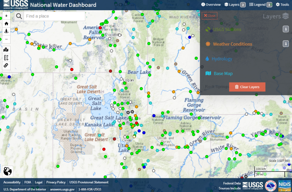
The National Water Center’s Operations Dashboard tackles the challenge of displaying multiple data streams without overwhelming users. Their approach allows operators to maintain situational awareness while accessing detailed information when needed. By organizing visualization services logically and enabling custom dashboard creation, they help users focus on the most relevant data for their needs.
The dashboard integrates numerous hydrological models, observation networks, and forecast products into a unified interface. Rather than presenting all information simultaneously, the system employs a hierarchical structure that reveals additional detail progressively. This design prevents cognitive overload while ensuring that comprehensive information remains accessible. Users can customize their view based on geographic region, data type, or specific monitoring needs, creating personalized dashboards that support their unique responsibilities.
The Operations Dashboard also exemplifies effective alert design, using subtle visual cues to indicate anomalies or threshold exceedances without disrupting the overall interface. This balanced approach helps operators maintain awareness of developing situations without constant interruption, an essential feature for a system that may be monitored continuously during critical events.
Practical Design Principles
From these successful implementations, several key principles emerge.
First, present overview information clearly before diving into details. This allows users to quickly grasp the general situation before investigating specific areas of interest.
Second, use consistent visual language for similar types of data across different sections of the interface, reducing the cognitive load required to interpret information.
Third, provide clear pathways to more detailed information, allowing users to explore data at their preferred level of complexity.
Fourth, maintain familiar interface patterns across different sections of the application, creating a sense of coherence and reducing the learning curve.
Fifth, enable customization without compromising core functionality, acknowledging that different users have different priorities and workflows.
Finally, design with accessibility in mind, ensuring that color schemes, text sizes, and interactive elements accommodate users with varying abilities and preferences.
Moving Forward
As environmental data grows more complex, intuitive interfaces become increasingly crucial. The success of these applications shows that effective design isn’t about simplifying the data—it’s about presenting it in ways that users can understand and act upon. For teams developing new environmental applications, these examples provide valuable templates. For Earth scientists developing new environmental applications, Tethys Platform provides both the technical framework and these exemplary implementations as valuable templates.
The open-source nature of the platform ensures it will continue to evolve alongside emerging Earth science needs, serving as a bridge between sophisticated environmental science and practical, user-friendly applications. Through thoughtful interface design, we can make complex environmental data more accessible and actionable for the communities that need it.
Join our journey of making scientific data more accessible and digestible by following Tethys Geoscience Foundation on LinkedIn today!
Leave a Reply